Thursday, August 13, 2009

Dogs Will Be Dogs.


So... I took a picture of Gloria the duck that my dogs decided to destroy. It was not supposed to be a dog toy but it was still a minor loss (however, it's easy for me to say this since the duck belonged to Marie, not me) anyway, I think it would be interesting to take portraits of all the everyday objects that the dogs in my household destroy. There are three dogs, and while we try to keep track of them, sometimes things get past us. This one is inspired by Andy Warhol’s ducks, but with a twist. :P

Friday, August 7, 2009

Summer Work!


Well, I haven't posted anything since class ended, but I want to continue with this blog!

This summer has unfortunately been kind of slow in the artmaking department. However I have been experimenting with some screen printing, and working on some drawings I plan to show at Kaleisia Tea Lounge in September. Including my all about tea final project from drawing, it is going to be a mixture of tea related and music inspired drawings. Random I know, but fun none the less.

If you're free on September 5th come to my opening from 7 - 10 pm. :)

Wednesday, April 22, 2009

Matthew Schlagbaum

Beards

I recently went to see Matthew Schlagbaum’s Beards exhibition in the center gallery. He was showing a series of photographs of himself wearing beards made up of different materials, all of which were supposed to represent masculinity; things such as used chewing tobacco, peanut shells, dirt and steel wool. In doing so he is exploring the social construction of masculinity, and expressing his own feelings of inability to live up to masculine ideals. The show also seemed to be commenting on how masculinity is something you have to grow and maintain, the way you would manicure a beard, also saying that masculinity can be easily taken away if not protected. He addresses the beards as if they were masks that alter his perceived masculinity. Not only did he have photographs of himself wearing the beards, but he included the actual beards hanging on the wall. I thought this show was a good combination of photography and sculpture.

Lisana Mohamed

On Monday I went to the center gallery with Emily to see Lisana Mohamed’s exhibition. Her work was bright and whimsical. It was expressive of Caribbean culture and a festival of color. Most of her paintings were very painterly and bright, and the subject matter had a dreamlike quality. I enjoyed her take on many things, such as sunflowers, that she showed in a new and interesting light.

Friday, April 17, 2009

Tea in Bowl


Tonight I went to the Tea in Bowl event at the Kaleisia tea lounge. It was sponsored by Lil Muddy’s of USF and a lot of hand made bowls were on display and for sale, most of which were crafted by USF ceramic students. There was live music and Kim, the owner of Kaleisia, performed a tea ceremony. It was actually great timing for me because I am currently working on a drawing final all about tea! Many of the bowls where very well crafted, and the atmosphere was fun. I enjoyed going and I like to see local artists and local businesses come together like this to host events.

Wednesday, April 15, 2009

Closure

MFA Graduation Exhibition 2009

I thought that Closure, the MFA graduation exhibition, was very impressive. One of the best shows I have seen this year, it included a wide variety of media and some heavy content. The gallery also had a telephone guide set up where I could call a number to hear some of the artists talk about their work. Particularly for James Reiman’s chromogenic prints, hearing him tell the story of the death of his father, and his fatherless childhood helped me to understand the magnitude of his work.

I was impressed with the instillation of the cabin in the corner of the gallery by Lauren Howard. It was ornate, and the antique heirloom qualities spoke to my own artistic process. Her intentions of creating a world comparing male and female object wasn’t apparent to me, however it may translate better if I were to see the work again.

Becky Flander’s images of a woman urinating while standing were by far my favorite. As I circled through the gallery, I kept going back to her images. This is obviously because they are aesthetically pleasing and very large in scale, but they also stir up a lot of emotions for me. I felt shocked and embarrassed, yet mesmerized and pleased. The colors are bright and playful and the figure emulates such power and confidence, as a woman I felt a hint of that “You go girl!” pride when I saw the work.

Monday, April 13, 2009

Screen Eroticisms

Artist lecture

Professor Amelia Jones’ lecture dealt with explorations of female desire in the work of Pipiloffi Rist. The works that she focused on were Schneeman’s “Fuses” and Rist’s Pimple Porno. She addressed how screen technology, the relationship between image and sound, and way the images were edited lend to the eroticism in two pieces made by different artists in different locations and time periods.

Fuses is a film of the artist’s and her lover’s sexual experience from the point of view of a cat. She uses that perspective to create an almost whimsical mood in the beginning. Done in 16 millimeter film, Fuses creates a painterly visual experience using the film as a textile material. Jones explains that the film comes to life as the movement and texture of the bodies is enhanced by extreme close ups and some abstracts of the rhythmic movements of the bodies.

Pimple Porno, meant to be shown as an analog video, was achieved using much more abstract means. At the beginning the felinity of the woman is portrayed using the sound of her heals and a close up as she walks. This peaks the senses of the viewer and creates the sensual mood of the piece immediately. Jones emphasizes the way Rist used the Woman’s gaze on her lover empower the woman sexually. Both partners are equally aggressive throughout the piece and at times the bodies mesh into one. Throughout the piece the bodies are floating in abstract space that imitates nature. The visual experience created feels like it could be touched. The focus of the piece is the softness and feeling of skin, often juxtaposed against rougher images of fruit. Jones lectured on how the sound adds to the effectiveness of the film, however I wasn’t able to hear it through most of the piece.

Both pieces show the women as empowered sexual beings pursuing the objects of their desire. Jones’ lecture helped me to understand the messages of these films in a way I never would have on my own. I think it’s fascinating what these artists were able to achieve such a perceptive experience for the viewers through erotic subject matter that could easily have come off as lewd if approached in a different way.

Sunday, March 29, 2009

Kathleen's Work


I really enjoyed Kathleen's text piece because of the way it fit so perfectly into the space that she choose. The area was full of lush green trees, which reflected in the mirrors on the boards with thoughtful quotes written on them. I also liked that the boards were large and black because they felt sharp and solid which created contrast against the natural background. Overall, i think making the boards interactive with chalk was a good choice, because it shows that she did get the reaction from her viewers that she wanted, however i would have liked to see them without writing. Before the chalk writing the piece had an beautiful subtle aspect that I enjoyed. I would like to see it installed in another location.


Friday, March 27, 2009

Art House

I went to art house tonight, and I enjoyed it a lot since I was unable to make it last year. I liked the entertainment, the food, ( even thought I didn't get in line to have any ) the little photo booth / pin idea, and the fact that everyone was there and it was just a fun time. However, I wasn't super impressed with most of the work. I know that there is much better work, especially from electronic media. The best pieces were in the advanced painting and drawing studios, and though I did not catch the artists name, one of my favorites was the large pencil drawings that included scenes of Jesus and large crowds of people and something that appeared to be the inauguration. The drawings were very well composed and had great perspective and depth. All in all I saw a bunch of people and had fun.

Thursday, March 26, 2009

A Penny for your Thoughts


I had a lot of fun with this project and really got into it. Tuesday was a little hard, not a lot of technical difficulties, but I was on a twelve foot latter for six and a half hours tying knots. :/ It was a good learning experience to see what it is really like installing something relatively difficult by myslef, and also a good lesson on being prepared. I brought everything I needed, except sunscreen! The seemingly simplest little thing like bringing sunscreen when you are going to be putting work up in the sun for hours and hours. I had to run to the bookstore and get some when I realized I was getting a little more than tan :P All in all, a great time. I also really enjoyed walking around and seeing everyone elses projects. It seems like mostly everyone stepped out of the box and really did something new for them, and I think we should all be proud. I'll be posting my review of someones work ( I think Kathleen's ) at a later date. I got some great pictures for her piece :)


Sunday, March 8, 2009

Summaries- Public Art as Text

Four Stages of Public Art

This essay explains the four stages of public art according to Roy Bhaskar’s formulation of a four-stage dialectic, which is the practice of arriving at the truth by the exchange of logical arguments. The stages are aligned with historical stages, and trace the transformations in the possibilities for public art. It talks about the different possibilities of public art, and how all types of public art in different locations encourage viewers to react and engage in different ways.

The first stage is non-unity, or of something “not being the same” as it was. This is how Bhaskar begins any argument that has to do with transformations. In the case of public art, the first stage is putting some art in some public space. It is the change that makes the non-unity of the art that is not the same as the art of the past.

The second stage is negation. Because the first stage did not include a connection between the making of art and the reception of that art by the public, this stage is the one where “the relationship between subject and object becoming visible.” This is the realization that the form of public art is changing the reaction of the audience to something other than it would have been without the art. Artists realize that the work is not detached from the public and therefore also change their art making process depending on how they think or want the public to view and understand it.

The third stance is totality, or the reciprocal relationship between the two stages. In public art this means that there is a conversation between the meaning of the artist and the meanings of the viewers.

The last stage is the practice of transformation, or the self transformation. Which in turns of public art means that it continues to transform the possibilities of what public art might be. So, this kind of art is difficult to judge because it is always transforming. Simply the act of attempting to define it is helping to change it more.

Protect us From What we Know

This article is about Jenny Holzer’s most recent work, in which she has used declassified government documents, that we made available through the Freedom of Information Act. as the source for her text based artwork. The work is done on silk-screens, which is a new and different medium of work for her. She tries to stick to using black and which because it gives her work the official feel of the documents, but in a larger than life bold manner. Holzer sees the documents as physical objects with specific visual qualities, and wants to stay as true to that as possible. The most significant visual aspect is the government censorship of the material before it is released, abstracting her work. She blacks out names and identifications, as well as some large sections. Her most notable screen is a large black and white print of the Phoenic memo, which was a warning to New York about a possible coordinated effort by Bin Laden to send students to the US to attend civil aviation universities and colleges. Her work is unique because it allows viewers to piece together the missing information and interpret the documents on their own

Thursday, February 26, 2009

Albrecht Durer

On Wednesday I got to go see an exhibition of Albrecht Durer’s etchings and woodcuts in the Museum of Fine Arts in St. Petersburg. Not only is his work fascinating and inspiring to look at, but the exhibition was very relevant to the work I have been doing in my drawing class, with figure drawings, as well as my history class that has recently covered renaissance art. The vast detail that he was capable of achieving with etching is incredible to see in person, and also the way he purposely exaggerated certain parts of the body makes me think about figure drawing differently. I made a sketch while in the museum, and it was interesting to study his technique of hatching and crosshatching to create dimension in the figures. Overall, I would recommend this exhibition to everyone. It’s only four dollars for groups.

This is the drawing I made in the exhibit.
I did my best to imitate his style of figure drawing.

Tuesday, February 17, 2009

Possible Artists for Opposites Project


I narrowed my options for the “Opposites” project down to three pieces.

I picked Charles Ray’s “Yes”, Chris Ofili’s Holy Virgin Mary, or something by Antony Gormley

Thinking about pieces for this project has been very difficult for me. The idea of opposites when assigned to a work of art, I think, is kind of arbitrary. Is the opposite of a two dimensional piece really a three dimensional piece? Or white the opposite of black? Not really. :/

Despite my confusions, I think this project is going to be a fun challenge. I look forward to seeing what we all come up with.

Wednesday, February 11, 2009

Our Performance


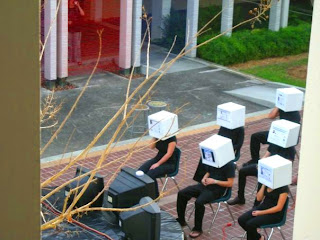
What a hectic couple of days! I thought we would never get that yarn up but the work was SO worth the payoff. In retrospect I am really glad we made a lot of the choices we did. The yarn looked great from across the courtyard and from above. I know we got some attention as well with all of those TV’s. The extension cords and the double projectors were also very effective, especially at night. All the people I talked to who saw us were really impressed. I think we should all be proud.
Yes we had our ups and downs with making choices about times and some stress about making other decisions but I think it was a really good experience. I learned a lot about what kind of work goes into a public art performance and I think we all learned a lot about each other. I really look forward to spending the rest of the semester with you guys.


The Yarn!!!


From Above

My Personal Space

My personal space on campus is the MLK fountain in front of the Marshall Center. The first time I sat there was before I was even a student at USF. I was here for a tour of the campus with my dad during my senior year of high school and in the middle of the tour I had an emotional breakdown. We were sitting on the benches near the fountain and I started to cry. I was overwhelmed about going to college and scared to leave my family and friends. I couldn’t picture myself here at USF. This is kind of a sad memory, but it has made that place very special to me as I have grown to live and love my years at USF. My freshman year I did one of my first photography projects there and first realized my love for art. I also spent time there with my current boyfriend, Adam, over the summer on one of our first dates. We jumped in the fountain for a swim and then laid out in the sun to dry. I still always remember that day with my dad, and how sad I was and scared. If only I had known how rich my life would become at USF.

So, to advertise our performance, I first thought it would be a good idea to take my box head to my personal space and use it (and myself) as the advertisement. However, I had second thoughts about giving our idea away that easily and decided to hand out flyers myself instead. Most people seemed friendly and interested, but of course there are always those few who turn them down.

Friday, February 6, 2009

Leslie Shows' Artist Lecture


At first glance Leslie’s work looks like simple landscape compositions, but they are made up of intricate collages with great detail. The pieces are relatively large in scale, but in order to get a full appreciation of the work they have to be viewed up close. Even the digital close up images she had to show were nothing compared to what I am sure the work looks like in person. I thought it was particularly interesting that she played with using multiple representation of the same thing in a single piece. For example, in one piece she used graph paper to represent salt crystals, and also used real salt water painted on the piece that started to crystallize. She also played with text in some of her pieces, which has always been a debate for me in my own work. In one piece she had segments of dust that were blowing through the air and one of the scraps she used actually had the word “dust” on it. Sometimes I am drawn to the idea of words in a piece but I think at times using legible text can make a piece less interesting. However, for Leslie, her work already has such depth from the elaborately detailed collages that the text adds another layer of interest and is not immediately noticeable. Overall, hearing Leslie talk about her work was an inspiring experience. She is such a young artist and has found a way, through her somewhat surreal subject matter and her mixed media method, to bring viewers into her own imaginary world.

Saturday, January 31, 2009

Body Worlds


Last night I had the chance to go to the Mosi and see the BodyWorlds exhibit, and I thought the experience was worthy of blogging. I don’t know if you guys got to see the Bodies exhibit when it was here a few years ago but I missed it then and this was my first visit. It was absolutely incredible. All of the organs and full bodies in the exhibit are real people that have undergone the process of plastination after their death. In a nut shell plastination is a very in depth process of replacing all of the fluids in the body with a polymer. The actual body tissues can then be eaten away by chemicals and a plastic version of the exact shapes of the tissues are left perfectly intact. Slightly weird at first to look at, the bodies are SO REAL looking!! Even the eye lashes are just as they were on the real person’s face. Seeing each and every vain within the body and the exact position of the heart as it rests inside the chest is an inspiring experience. You should all go check it out of you have not already. It may even be a good place to sit with a sketchbook.

Wednesday, January 21, 2009

Central Patio of FAH

Space as Movement


Before my research of the central patio if the FAH building, I stepped back and observed the FAH building as a whole and it very much influenced my interpretations of our patio. The building is for the most part broken up into three different sections. I refer to them as the art side, the administration section, and the music side, and there are two central patios; the one we are analyzing and another one in the music section of the building. I noticed that these two patios are visually very much the same in size and layout, but are occupied in very different ways. In fact, the other patio seems to be occupied by students significantly more than our patio is, and it is a place for students to collaborate on projects, eat lunch between classes, and socialize. I think this has to do with the uses we have given “our” patio (vs. that the music students have given theirs) and the different needs for space the art students have. The variation in occupancy between these two seemingly identical spaces interested me the most in my preliminary observations of the space, so I choose to analyze the central patio space of the FAH building using the Space as Movement approach.
I have always been fascinated with public spaces and how people move about them. The way people move through a space directly corresponds to the character of that space, and the use people assign it. The FAH patio is used by art students mostly as a space to display artwork (like the big murals that are sometimes up at either end) or as a space for instillations of artwork. It is a large space that doesn’t seem to get large amounts of student traffic, so it could be a desirable location for a larger more intrusive instillation of work. It is also sometimes used for art supply sales or ceramic sales. Circulation of the space is minimal. When students get out of class they usually follow the walk way around the patio rather than cutting through it. However, the pillars that surround the space make it feel intimate and somewhat closed while also giving full visibility of the space from every angle, even above. This could positively affect the work because it would allow something large, that perhaps filled the whole space, to be seen from every angle. Also, on a smaller scale, the pill in the center of the patio could serve as platform for a smaller piece, or even an interactive one. Because it would be placed on the platform, the piece would feel more featured (if that was the desired effect.) Also, an interactive piece would be accessible that way form all sides. Through the daytime the occupancy of the space doesn’t change too much. Occasionally there is a person or two sitting at the tables or on the benches, and the most traffic, which is generally just a few people, is between classes. When the sun goes down, I would assume there would be even less movement because the darkness discourages out door leisure, and most students and teachers leave USF to go home for the night.
I think an interesting way to utilize this space would be with something that alters the normal use of the space, and the normal movement and circulation of people around the space.

Sunday, January 11, 2009

Blog Assignment #1

Public Art
Agnes Danes/ Wheatfiel
d


"The power of the paradox" is a commanding statement about Agnes Danes' Wheatfield project. Obviously associated to the Idea that taking the time and money to plant a wheat field In New York City Is a paradox, the statement also hints at a much larger paradox. She correlates the wheat field to human life. Our simple need to live, breath, grow, and eat is all present in the wheat field. She even connects it to our memories of childhood summer days and the deeply rooted ideals of the American dream while comparing it to the big, bustling, money driven city of New York. the real paradox is that the roots of humanity are missing from this esteemed center. Agnes Denes' writing style is extremely descriptive and organized. The way she describes her process at the beginning and then leads into how her process lends itself to her concept made the discussion effective. One of her successes, I think, was her ability to include such a cohesive concept with a heavy statement; planting a wheat field In the middle of New York City. If she had failed to tie in her own feelings about wheat as a statement with the field as the object, the entire project would not have sounded cohesive. This is a challenge that I find when writing about my own work. I consciously make certain decisions, like Danes made the decision to use wheat verses corn In New York verses Chicago, but I then have a hard time articulating where those decisions come from. I am also similar to Danes In the sense that for the most part I enjoy projects that make a statement. Although there is much to be admired In work that only has aesthetic value, I'm drawn toward works that have a concept that goes beyond visual elements. I aspire for that In my work as well. The elements that Agnes Danes included, such the color of the wheat and why she choose it, the location of the project, and the time she put into it, were all essential to the read of the project. It's very necessary for the viewers to understand the reasons behind those choices that she made. It allows for more reflection and understanding of want statement she Is really trying to make; that time Is money and money rules. This is enhanced by her description of the amount of time she and her assistants spent cultivating the field. The idea is also driven home by the fact that she choose New York City over any other city. New York is the center of commerce In the United States. Also, her description of wheat being connected to the American way of life and It’s ability to evoke emotion In the American people really helps to connect the viewer to the piece and the wheat as the object of the statement.

Introduction!


The last substantial drawing I did was the one for my drawing final last semester. It has it's issues but the most challenging thing about it for me was that it was huge. ( about 8x8 feet )


My name is
Jysikka Ryan, and I am a Studio Art major here at USF but I have not yet decided on a concentration. I like photography and drawing, and I am very excited about the electronic media course I am taking this semester. I would say my weaknesses in my art making process involve organizing my ideas into a cohesive concept. Sometimes the feelings and ideas I have in my head get lost on the way out… if that makes sense. I do however feel that I am getting better all the time and learning from everything. Each person that I meet and every class that I have inspires me in new ways. That’s what I think art is all about, and I am excited for this semester of concepts II!